As bards.ai founder, I've build 40+ pitch decks and client porposals in 2025. Some closed good deals. Other failed miserably. The main difference was one thing - you need to be clear and fast with delivery.
I'm going to walk you through building a real pitch deck from scratch, slide by slide, showing exactly what works and what doesn't. Screenshots of everything.
Let's go.
Start with text, not slides
This is the single most common mistake I see. Founders open a presentation tool and start dragging boxes around before they've figured out what they're saying.
You will loose SO MUCH time draging boxes, choosing colors, finding images. Just to find out few hours later that you will scrap the slide.
Don't do this. Open a text editor. Write your story as bullet points first.
Here's what I start with — just rough notes in a doc:
No formatting, no design, no slides. Just the story. I spend 30–60 minutes here before I touch any presentation tool. This is where 80% of the work happens.
The structure I'm aiming for is max ~10 slides - tbh nobody will read more. Here's the rough order (don't follow it strictly, but it's good idea to have in mind):
- Title
- Problem <---- most important.
- Solution
- Product demo
- Market size
- Business model
- Traction
- Competition
- Team
- Financials
- The ask
- Contact / CTA
This is basically the Sequoia format with minor tweaks. It works because investors have seen thousands of decks in this order - they know where to look for what they care about.
But if you have to have 1 thing in mind. ALWAYS START WITH PROBLEM. You need people to understand the issue you are trying to solve.
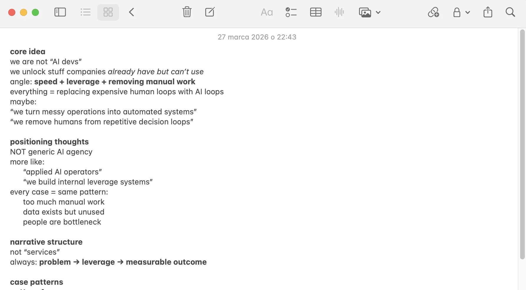
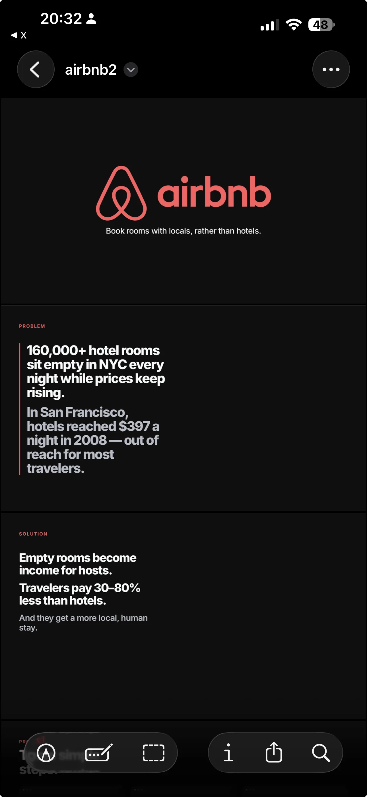
Slide 1: Title
The easiest slide and the one most people overthink. Company name, logo, one line. If you have brandbook, well you are done.
If not - keep it simple
Airbnb's was: "Book rooms with locals, rather than hotels." Five words. That's the bar.
I see founders stuff the title slide with taglines, founding dates, team photos, social proof. Don't. You have 7 seconds before an investor forms a first impression. One idea.
Slide 2: Problem
This is the slide that decides everything. If an investor doesn't feel the pain here, the rest of your deck is dead.
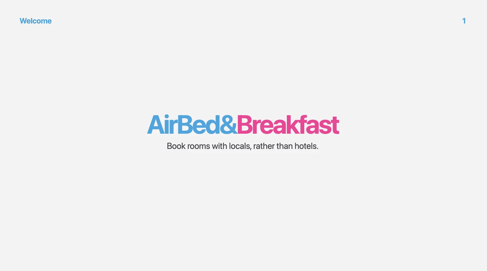
Here's a bad problem slide vs. a good one:
Look at the slide - what do you see? You need to focus to understand what is writen. There is some statement, there is some data, but you need to be honest - investor crunching though pitch decs will probably eyeball the slide and move on, not TRULY understanding the problem.
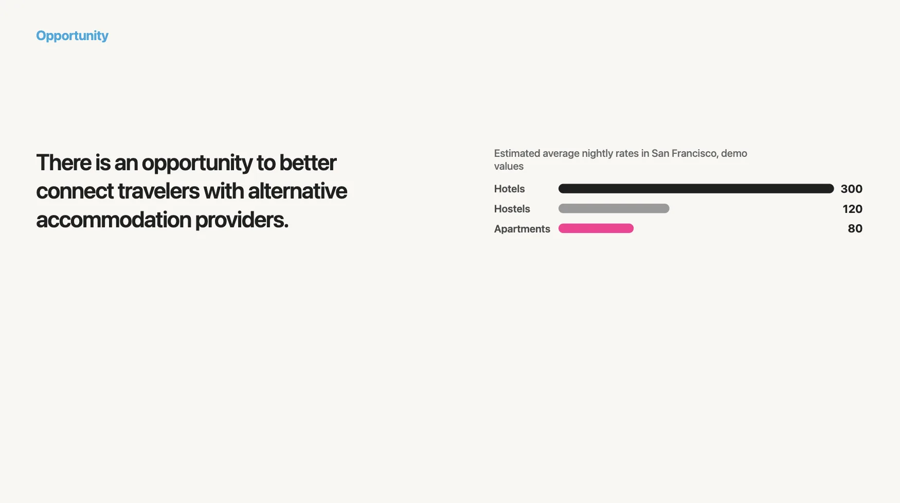
Now look at this:
That's it. Two sentences, completely different impact. The investor immediately gets the tension — there's supply sitting unused while demand is overpaying. You don't need a chart to feel that.
Slide 3: Solution
Mirror the problem. For every pain point you raised, show how you solve it. I literally structure it as a 1:1 response.
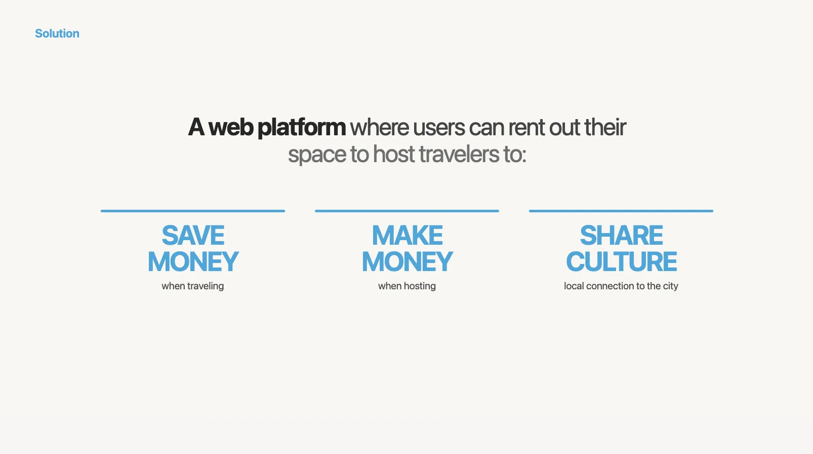
The key here:
- Empty rooms -> Fill the rooms and make money
- Expensive hotes -> Cheaper rooms And sharing culture as a cherry on top.
You really don't have to overthink that. If your solution isn't obviously solving the problem, maybe it's time to get back to sketching board?
One sentence per solution. Don't explain how it works yet. That's nto the place. You would only loose the attention.
Again - Keep It Simple.
Slide 4: Product / How it works
Now you show it. This is the slide where screenshots and demos earn their keep.
I usually do a 3-step workflow or a product screenshot with callouts:
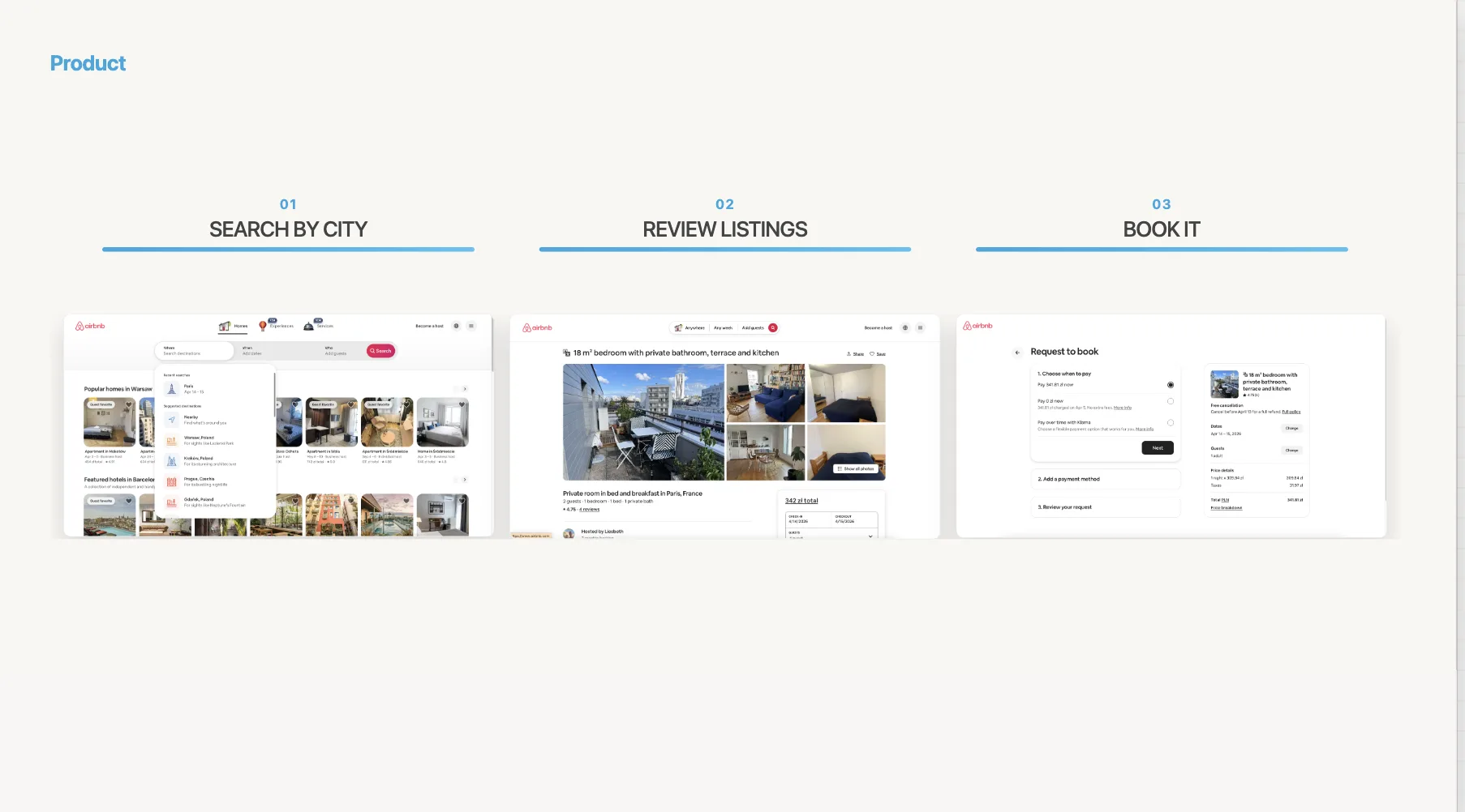
If you think about this, for AirBnB those 3 screenshots essentialy shows 99% of the value of the app.
Be mindfull of what you show. NEVER show stuff like loggng, settings etc. Those provide no value. Show screenshots that make it obvious how your app works, how it provides value to the end-user.
Slide 5: Market size
This is where most founders lose credibility. They google "global market size for X" and slap a $50B number on the slide. Investors see through this instantly.
Here's the wrong way:
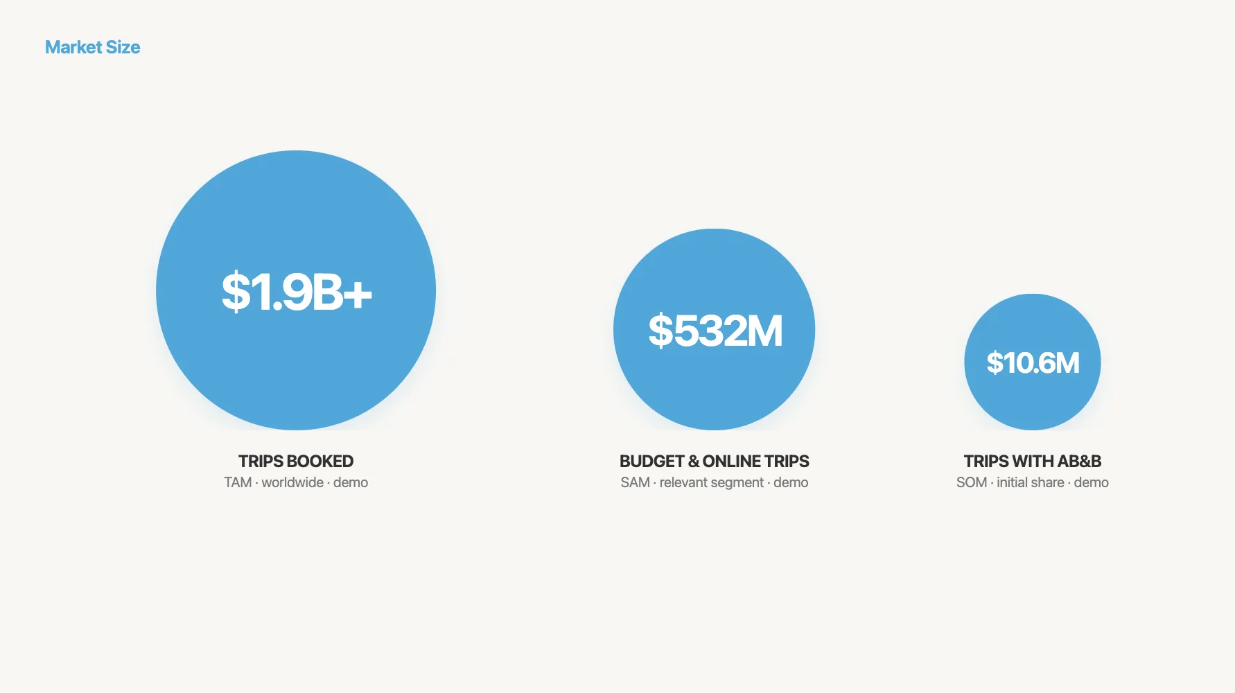
"The global presentation software market is $50B. We just need 1%."
This tells the investor nothing. Here's the right way — bottom-up:
"4.2M sales teams in the US × $2,400/year per team = $10.1B SAM. We're targeting mid-market SaaS companies first: 340K teams = $816M SOM."
Show your math. A credible $300M beats a hand-wavy $3B every time.
Slide 6: Business model
One sentence: how do you make money?
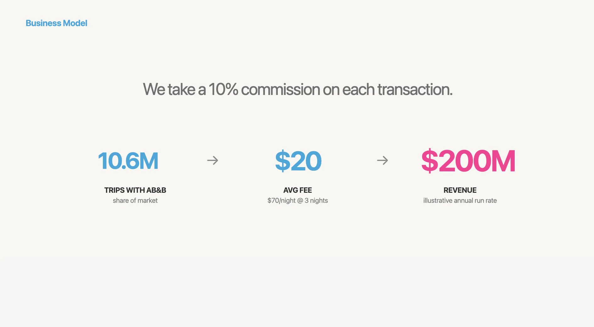
Airbnb's was: "We take a 10% commission on each transaction." That's it.
If you have pricing tiers, show them. If you have unit economics (CAC, LTV, payback period), include them. Investors spend 48% more time on this slide than founders expect — it matters more than you think.
Slide 7: Traction
This is the slide investors care about most. It's also the slide where I see the biggest range between good and bad decks.
Bad traction slides list vanity metrics. Good ones show momentum:
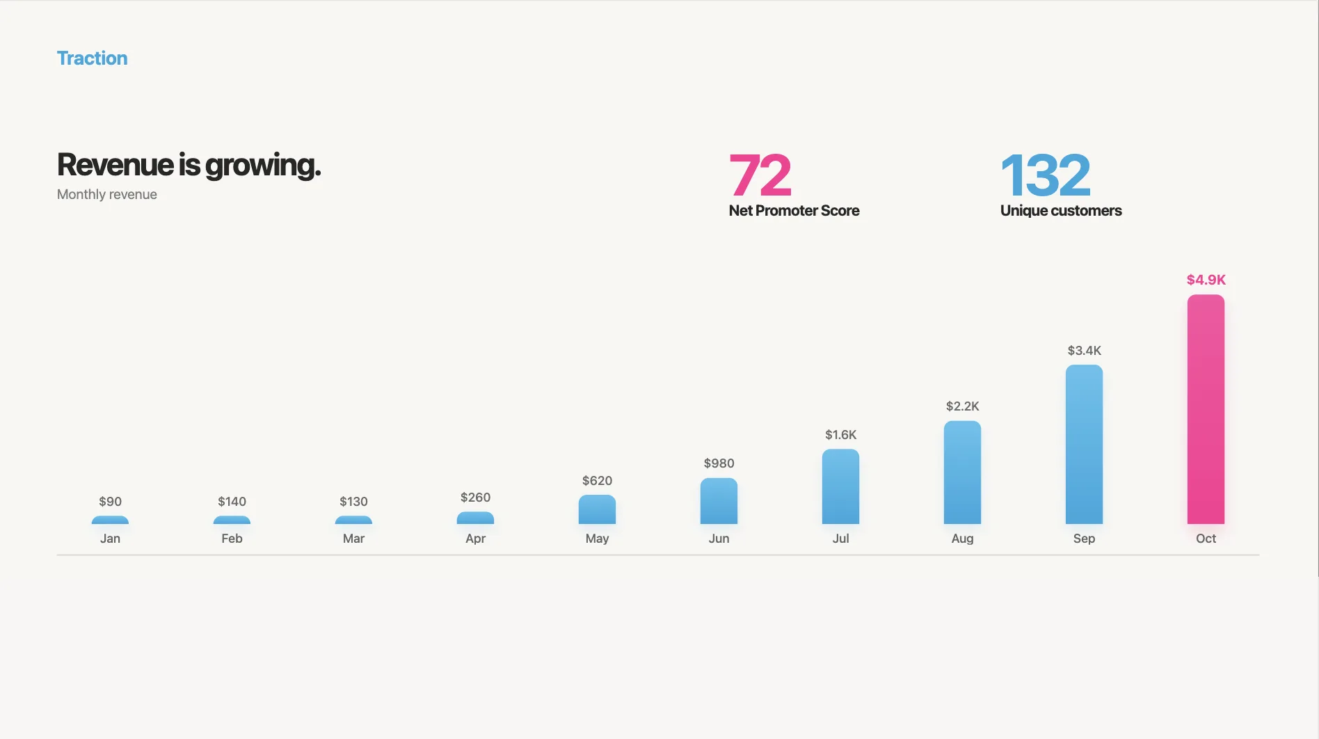
What works:
- Revenue or MRR with month-over-month growth
- A chart that goes up and to the right (obviously)
- Key customer logos
- One or two proof points: "40% week-over-week growth" or "NPS of 72"
If you're early-stage and don't have revenue yet, show leading indicators: waitlist size, pilot results, letters of intent, user engagement metrics.
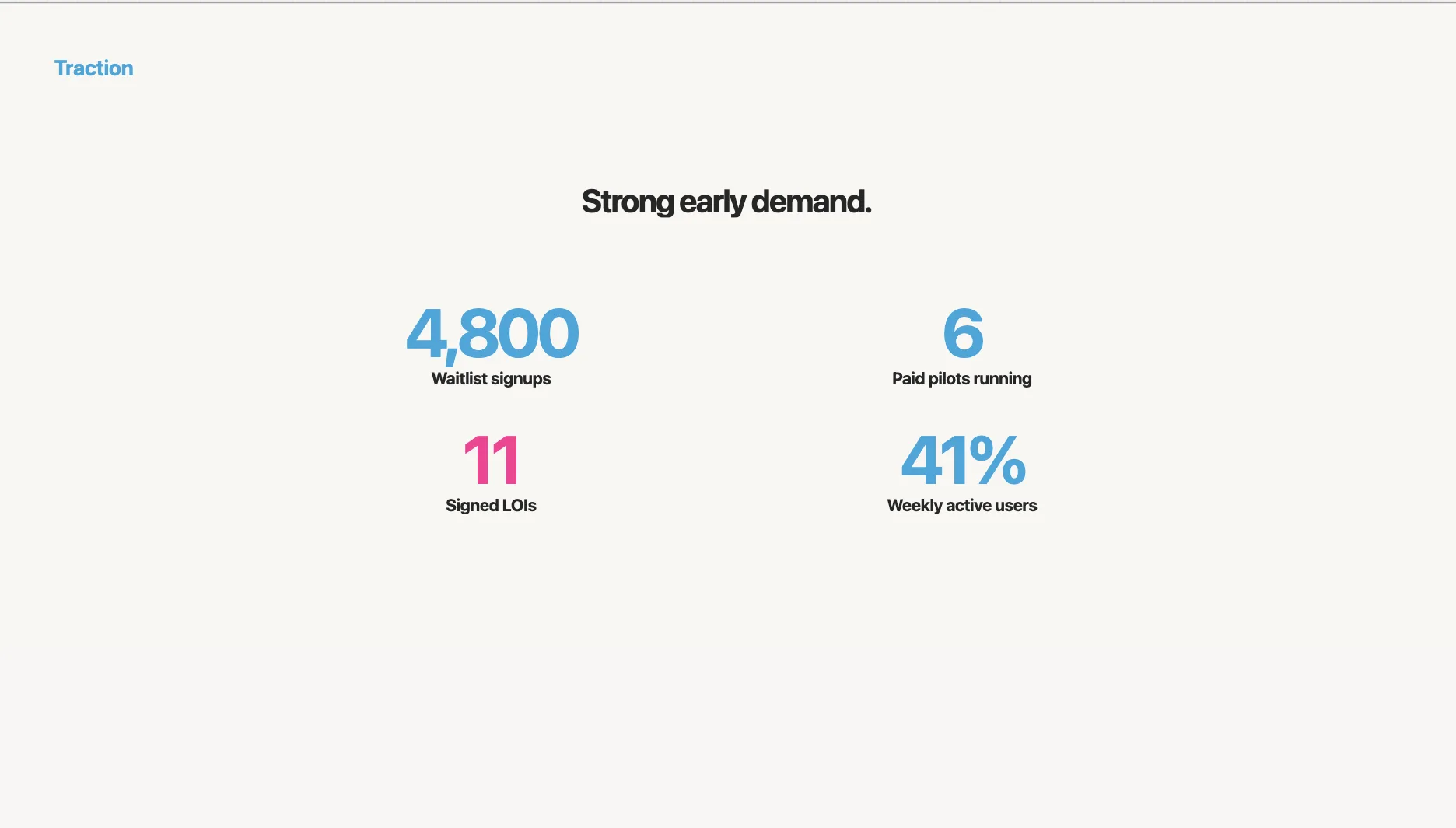
The point is momentum. Even small numbers with strong growth rates tell a story.
Slide 8: Competition
Never, ever say "we have no competitors." I've seen this tank otherwise strong decks. Every company has competitors — even if they're spreadsheets, agencies, or doing nothing.
Skip the feature comparison table. Use a 2x2 positioning map:
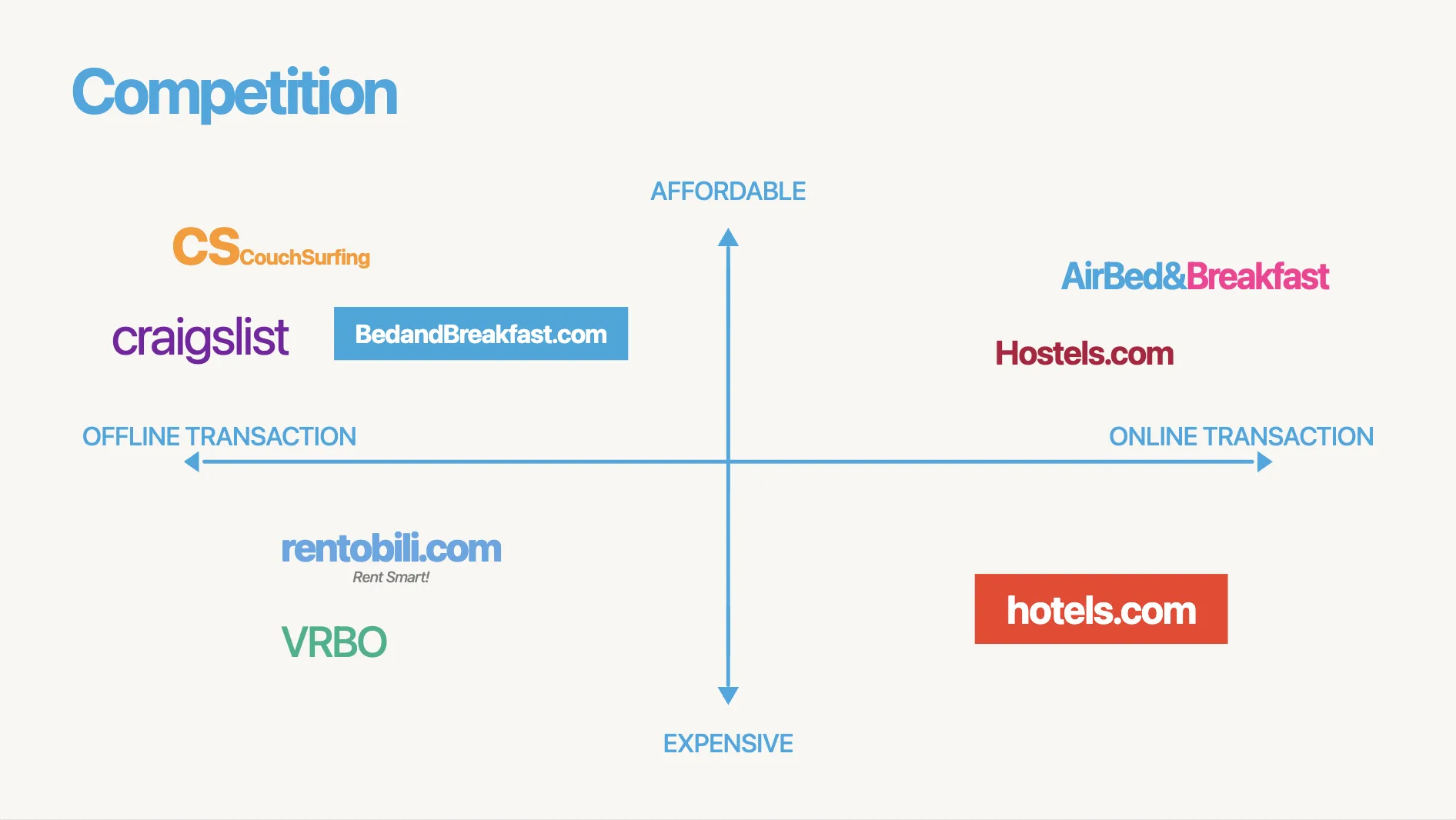
Pick two axes that make you look good (you're building the narrative, after all). Then place competitors honestly. The empty quadrant you're occupying should be self-evident.
Here's an example of what NOT to do — the feature checklist where you have all the checkmarks:

Nobody believes this. Investors have seen the same table from your competitor, with the checks reversed.
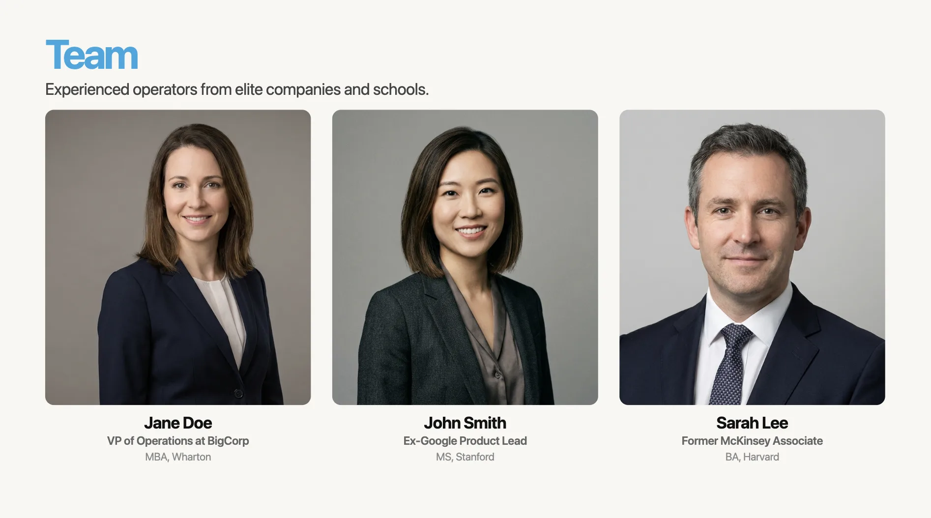
Slide 9: Team
This slide appears in 100% of funded decks. It's also one of the most boring slides in most decks, because founders just list credentials.
"Jane Doe — VP of Operations at BigCorp, MBA from Wharton." This tells me nothing about why Jane will win in this market.
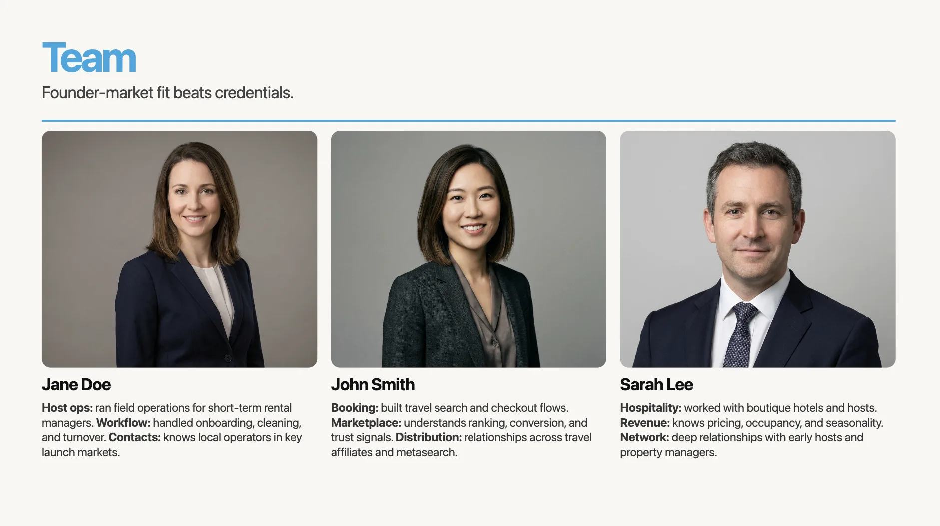
Now, on the other hand, look at this:
"Jane spent 7 years running logistics ops at BigCorp. She managed the exact workflow we're now automating — and built internal tools that saved $2M/year."
Founder-market fit > credentials. Connect each person's background to a specific challenge your startup faces.
Slide 10: Financials
Here's a stat that stopped me in my tracks: in a study of 320 pitch decks, 0% of the failed decks included a financials slide. Every successful deck did.
Don't skip this.
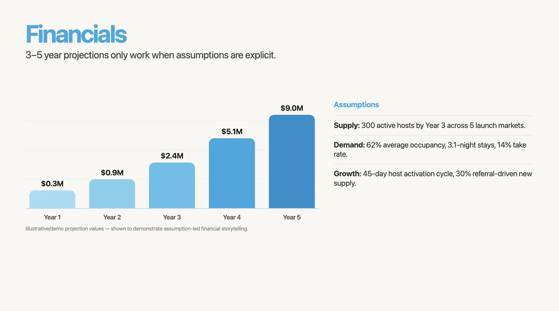
Show 3–5 year projections with clear assumptions underneath. The assumptions matter more than the numbers. "12 customers at $24K ACV, 45-day sales cycle, 30% close rate" is infinitely more credible than "we'll hit $50M by year 3."
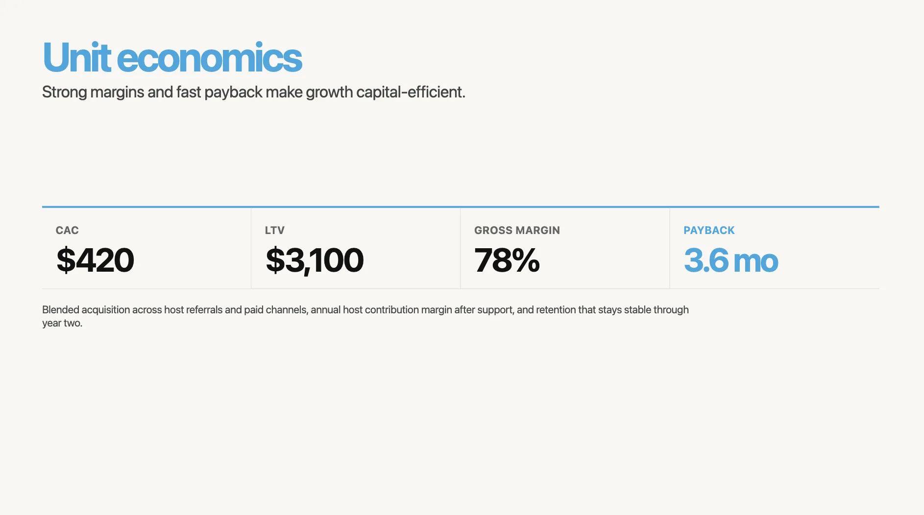
If you can show a unit economics slide (CAC, LTV, payback period, gross margin), do it. This is where sophisticated investors spend their time.
Slide 11: The ask
Be specific. "We're raising a seed round" creates four unanswered questions.
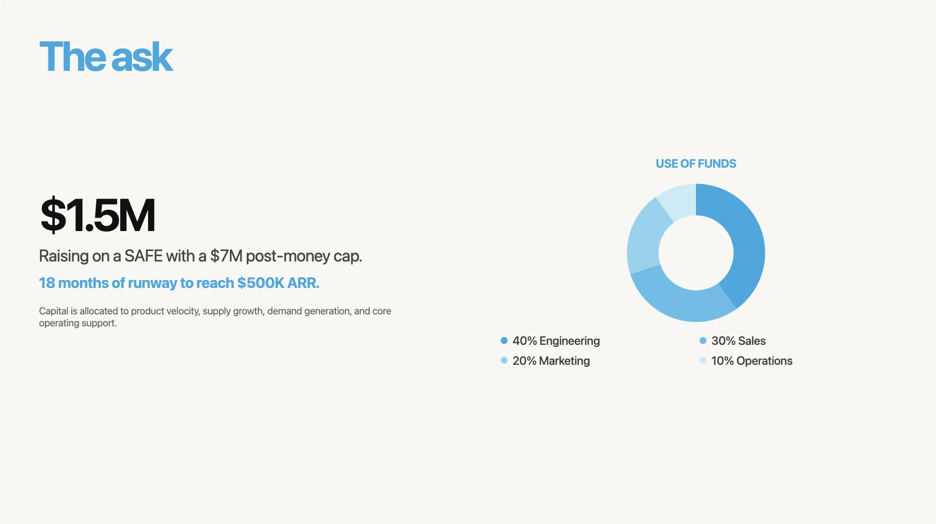
"We're raising $1.5M on a SAFE with a $7M post-money cap. 18 months of runway to reach $500K ARR."
Include a use-of-funds breakdown. Even a simple pie chart works: 40% engineering, 30% sales, 20% marketing, 10% operations. Investors want to know their money has a plan.
Slide 12: Closing
Don't end with "Thank you." End with a call to action.

Decks that close with "Let's talk" or "Book a meeting" + contact details get 22% more follow-up meetings. Make it easy to say yes.
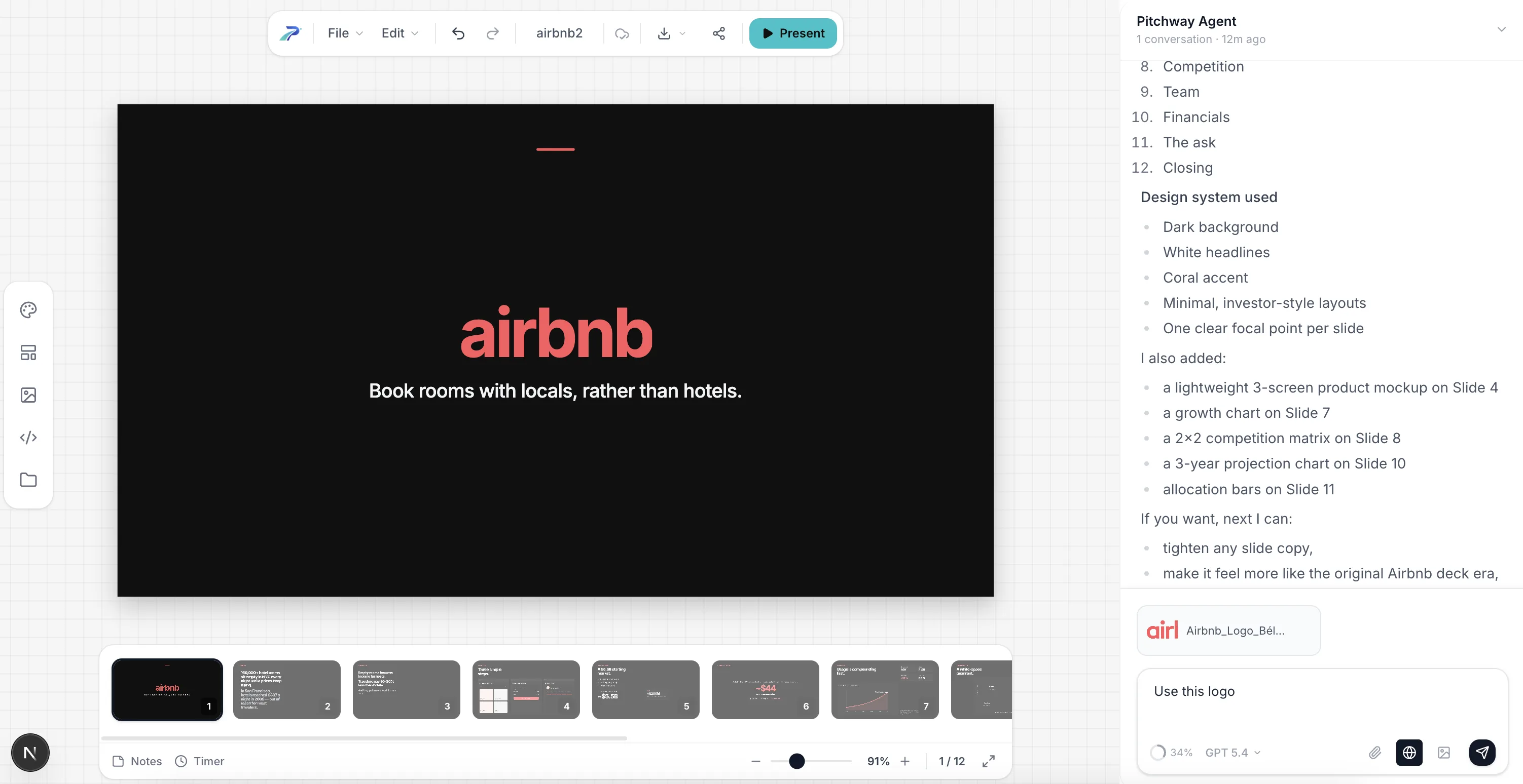
Now let's actually build it
You've got the structure. You've got your raw notes. Now you need to turn this into something that looks like it was designed by someone who knows what they're doing.
Here's my actual workflow:
Step 1: Dump your notes into an AI tool
I take those raw text notes from earlier and paste them into a presentation AI. Here's what that looks like:
The prompt I use for the example:
Create a 12-slide pitch deck for Airbnb — a marketplace that lets travelers book rooms with locals instead of hotels.
Slide 1 — Title
Company: Airbnb. One-liner: "Book rooms with locals, rather than hotels." Logo + tagline only, nothing else.
Slide 2 — Problem
Two core tensions, no jargon:
- 160,000+ hotel rooms sit empty every night in NYC alone while prices keep rising
- Average hotel rate in SF hit $397/night in 2008 — priced out for most travelers
Keep it to 2 sentences max. Make the investor feel the pain.
Slide 3 — Solution
Mirror the problem 1:1:
- Empty rooms → homeowners list spare space and earn money
- Expensive hotels → travelers pay 30-80% less than hotel rates
- Bonus: authentic local experience, cultural exchange
Slide 4 — Product / How it works
3-step flow with screenshots:
- Browse & find a room (search UI)
- Book & pay securely (booking confirmation)
- Stay & review (review screen)
No settings screens, no login flows.
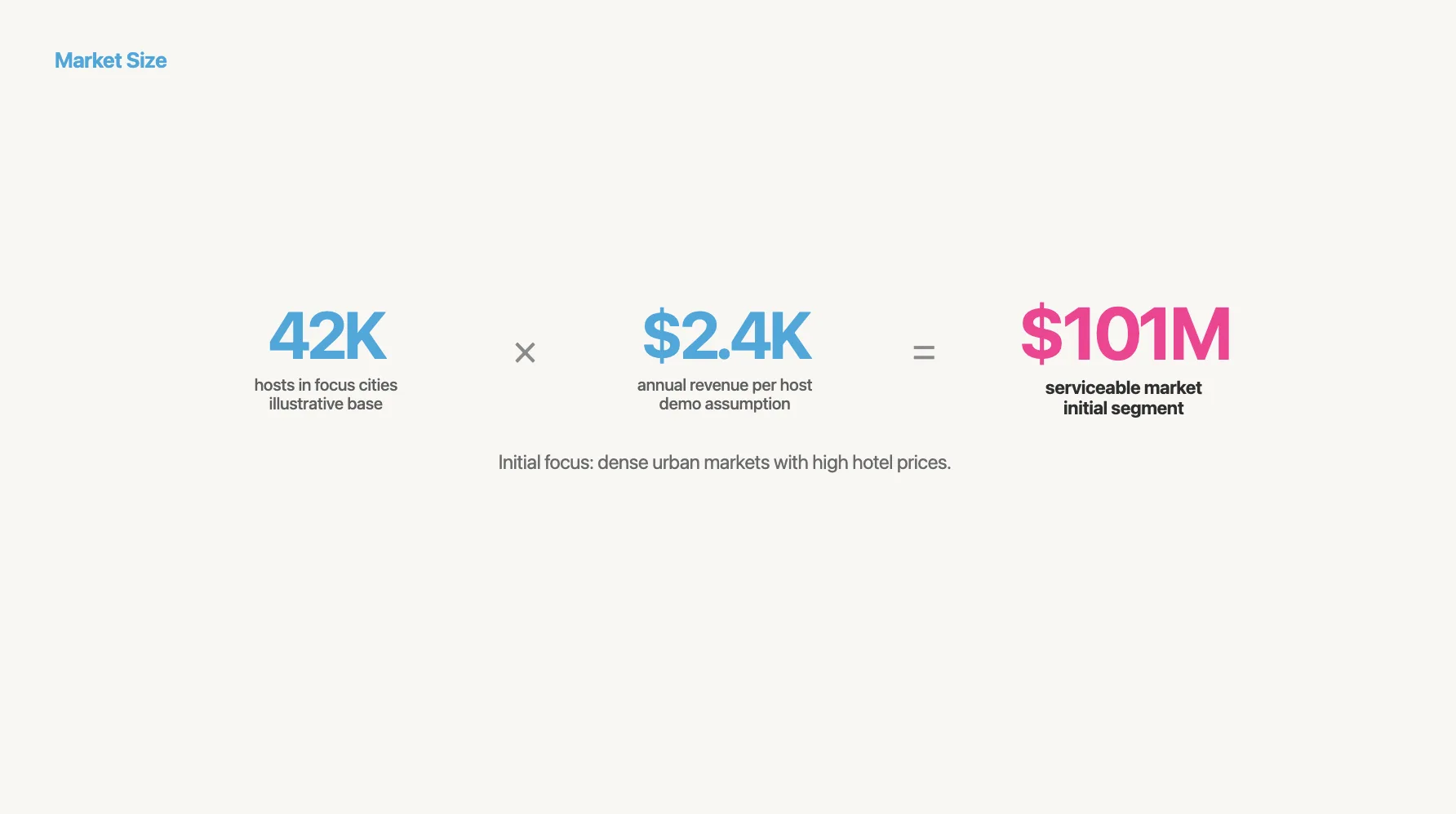
Slide 5 — Market size (bottom-up)
- 10.6M international trips to the US annually (budget/mid-range travelers)
- Average trip = 4.3 nights
- Average nightly spend on accommodation = $120
- SAM = 10.6M × 4.3 × $120 = ~$5.5B
- SOM (year 1, targeting 5 US cities) = ~$200M
Show the math on the slide.
Slide 6 — Business model
"Airbnb takes a 10% service fee from guests and a 3% host fee on every booking."
Show average booking value ($120/night × 2.8 nights = $336), so ~$44 revenue per transaction.
Slide 7 — Traction
- 10,000 nights booked to date
- 2,500 listings in 8 cities
- 40% month-over-month growth in bookings
- 80% of guests leave a review (high engagement signal)
Chart showing bookings growth over last 6 months.
Slide 8 — Competition
2×2 matrix. Axes: price (low–high) vs. experience (generic–local).
- Hotels (high price, generic) — Hilton, Marriott
- Hostels (low price, generic) — Hostelworld
- Vacation rentals (high price, local) — VRBO, HomeAway
- Airbnb (low price, local) — empty quadrant
No feature checklist.
Slide 9 — Team
Founder-market fit, not credentials:
- Brian Chesky — R ISD designer who couldn't afford SF rent, air-mattressed strangers in his apartment to pay bills.
- Joe Gebbia — RISD designer, obsessed with trust mechanics in peer-to-peer interactions
- Nathan Blecharczyk — engineer, built the entire platform solo in 3 months
Slide 10 — Financials
3-year projections with assumptions:
- Year 1: 80K bookings, $2.7M revenue (13% take rate)
- Year 2: 400K bookings, $13.4M revenue
- Year 3: 2M bookings, $67M revenue
Assumptions: 5× annual booking growth, $336 avg booking, stable take rate.
Show unit economics: CAC ~$15, LTV ~$210, payback < 1 month.
Slide 11 — The ask
"Raising $600K seed on a convertible note. 12 months of runway to reach 25 cities and 500K bookings.
Use of funds: 50% engineering, 25% growth/marketing, 15% operations, 10% legal."
Slide 12 — Closing
CTA: "Let's talk — brian@airbnb.com"
"Every night, millions of rooms sit empty. We're filling them."
Step 2: Review the first draft
The AI generates a structured deck with layout, typography, and visual hierarchy already handled. It's not perfect, but it's a starting point that would have taken hours manually.
Not bad. But also not quite ready. That's expected - the AI gives you structure, you need to tweak it.
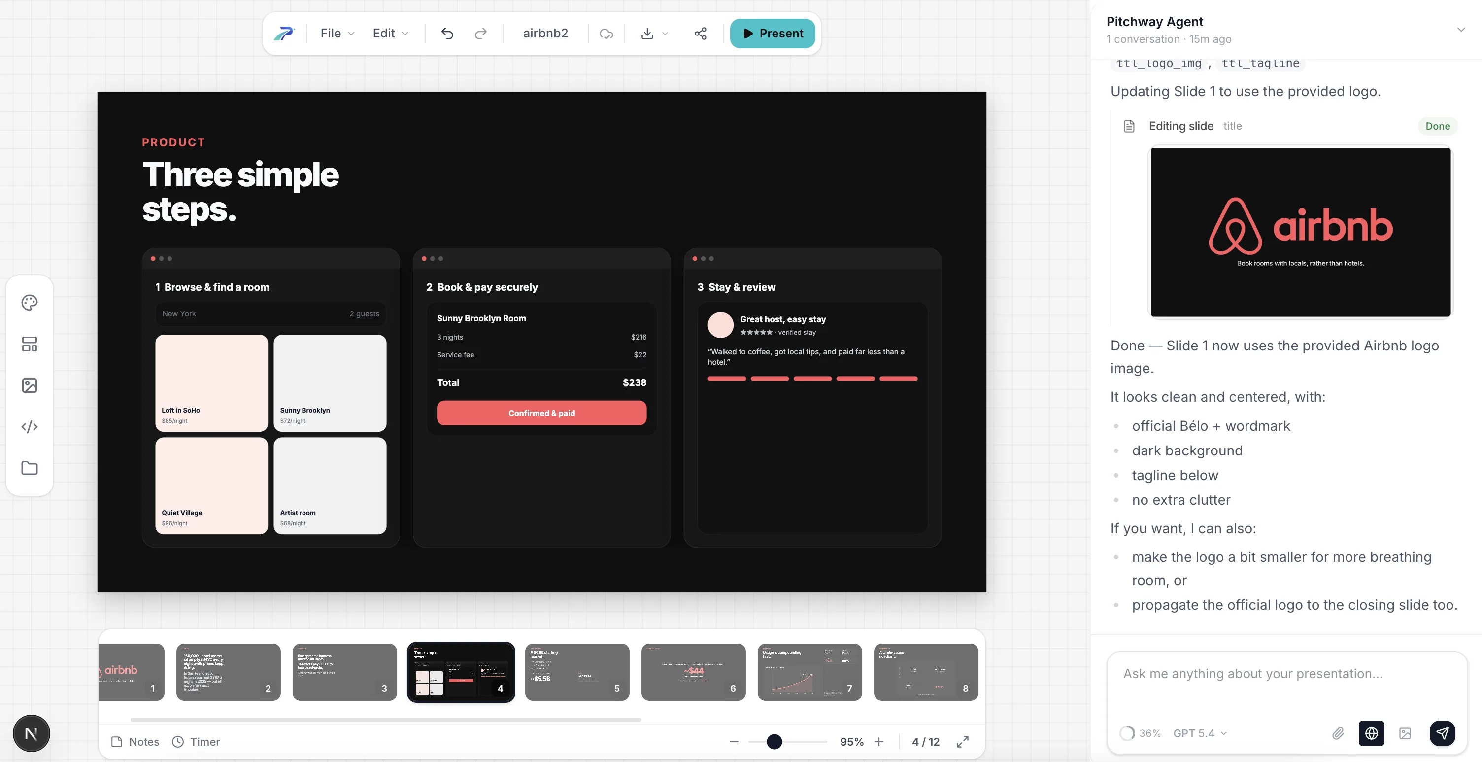
Step 3: Edit slide by slide
I go through each slide and see if i need to update sth. The AI keeps the design consistent while I focus on the message.
On the first slide, for example, I didn't yet setup the brand, so it didin't know about the logo. Let's fix that by giving pitchway the logo:
![]()
Step 4: Add your data and visuals
In a lot of cases you might to want to custom assets, like charts, screenshots, logos - just drop them in. The layout adjusts automatically.
You can also generate the needed images! Here the ai created prototype visualization, but it's missing images of the rooms.
Let's add them! Just prompt sth like
Generate images for the rooms and for the reviewer.
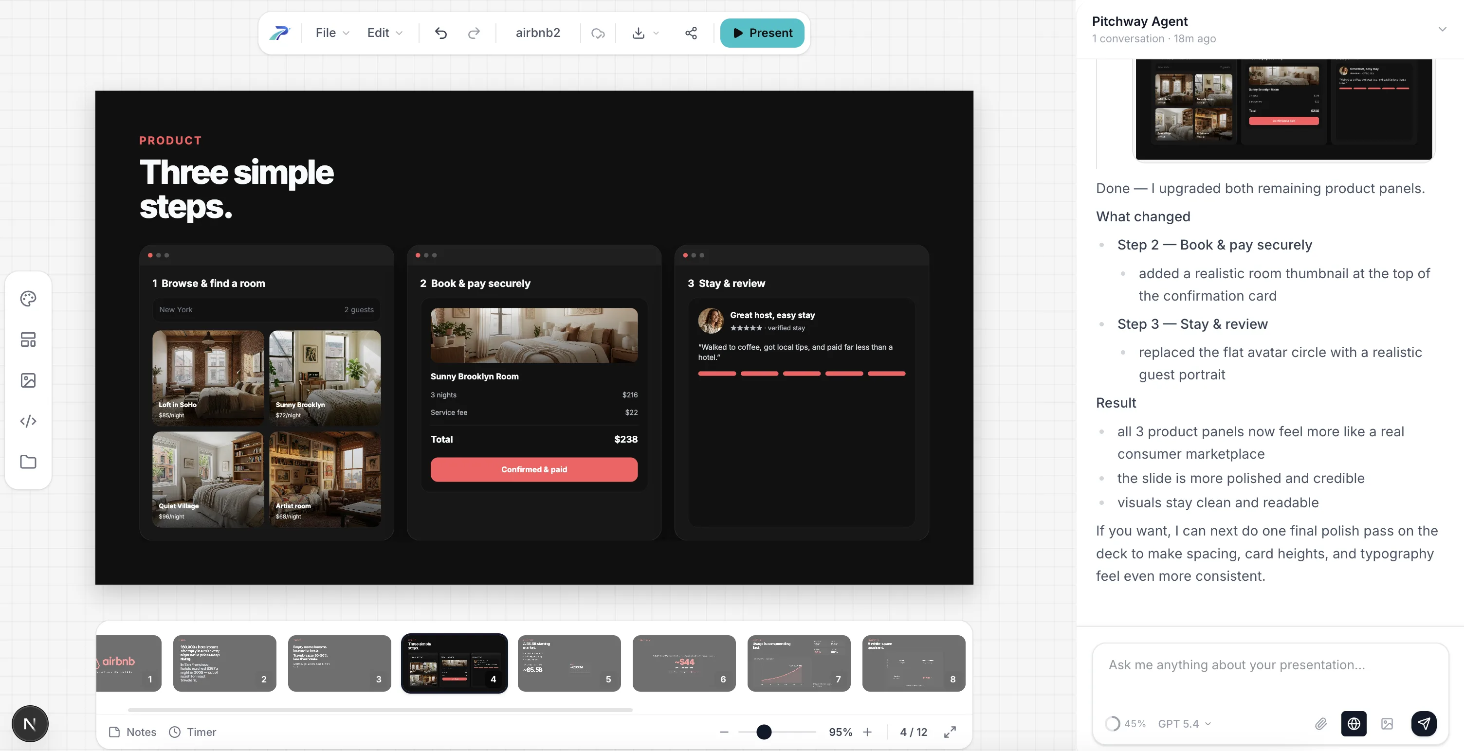
And voila! Much better, isn't it?
Step 5: Create investor-specific versions
This is the step most founders skip — and it's the one that can make your presentaiton shine. Different investors care about different things.
Eg.: a technical VC wants to see your architecture. A generalist wants the market story. A strategic investor wants partnership potential.
Let's assume we are sending to silicion valley tech angel. He might want to see what tech are we using. Let's do it, it's just 1 prompt, after all (ofc in real case use real tech, don't leave it to ai to guess!!!)
And in lest than 30 seconds we've got ready slide
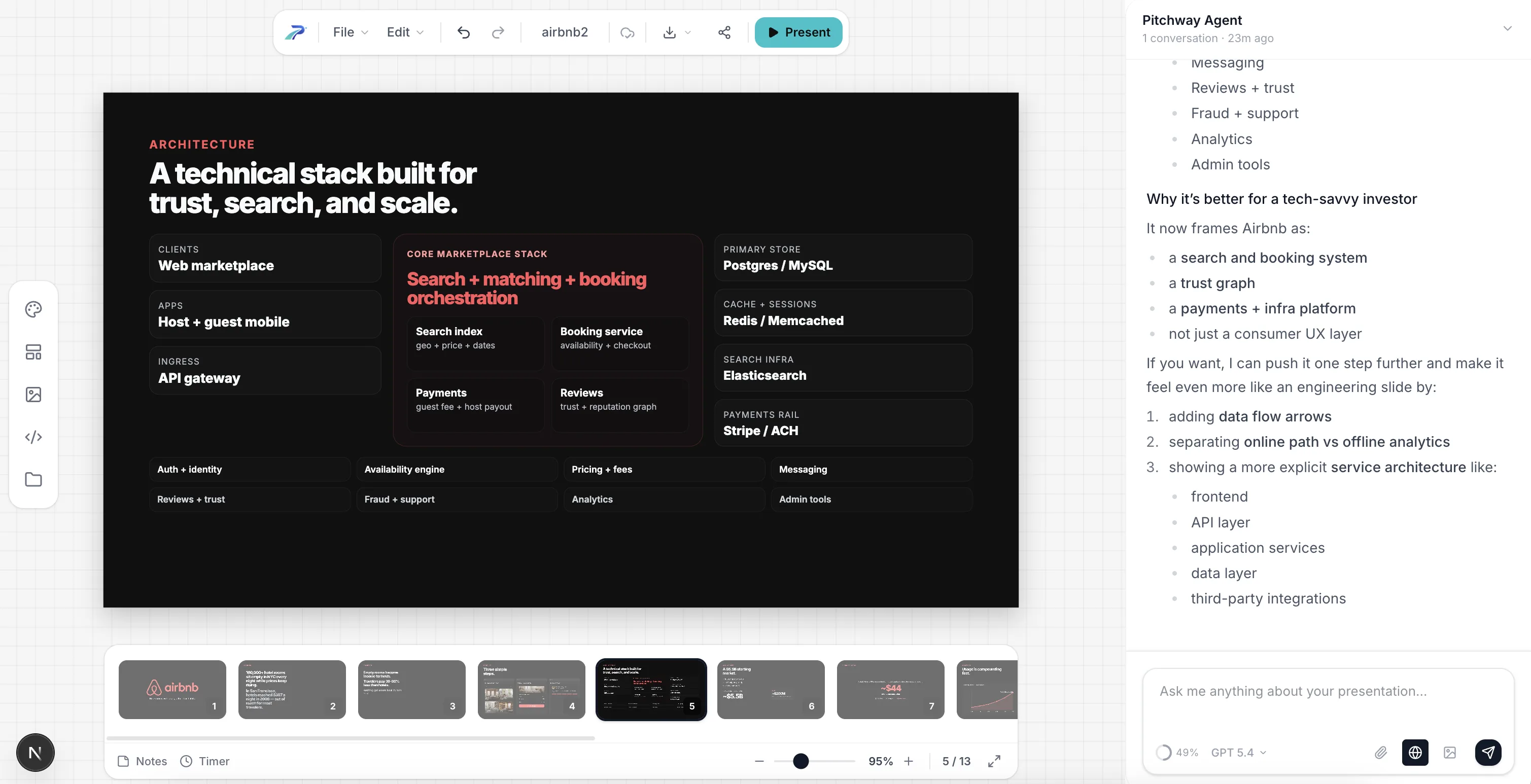
Done. Try doing that manually across 15 investor meetings. That will take you 15-30 minutes max, and will maximize your chances!
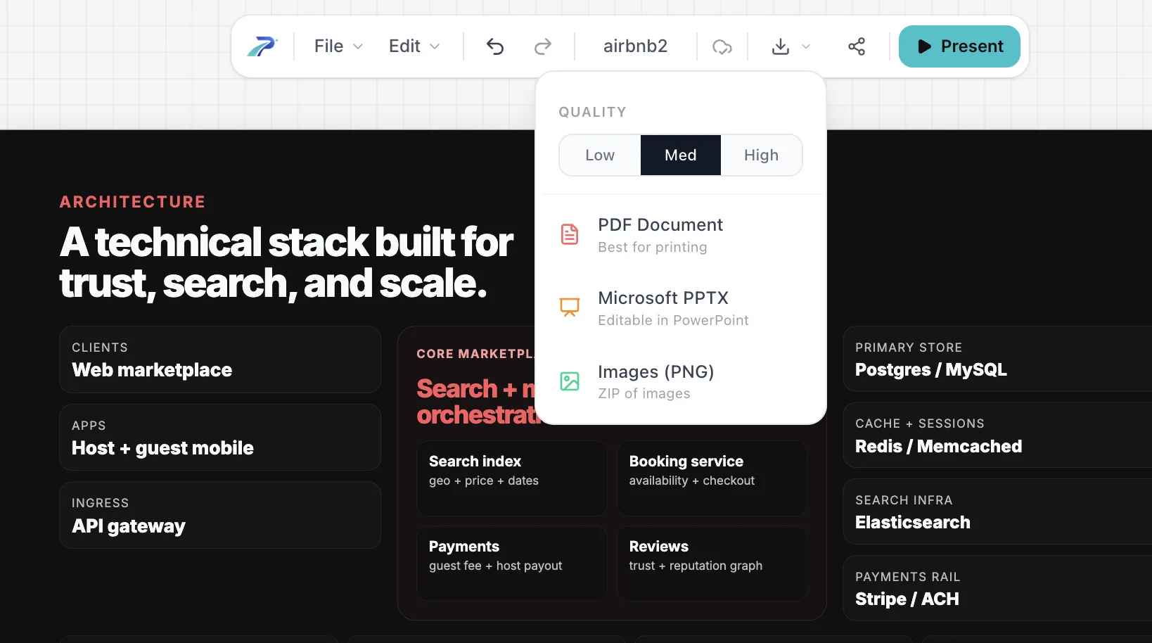
Step 6: Export and send
Export as PDF. Always PDF. Never PowerPoint, never Keynote. Fonts break, layouts shift, animations crash.
The numbers behind all of this
I keep these stats taped to my monitor. They should inform every decision you make:
- Investors spend 2 minutes 24 seconds on a pitch deck on average
- 31% of readers bounce within the first 10 seconds
- VCs receive ~3,000 pitches/year and fund about 9
- Decks with 11–20 slides have 43% higher success rates
- 94% of first impressions are design-driven
- Personalized decks increase engagement by 29%
- 70%+ of initial reviews happen on mobile
That last one matters. Pull up your deck on your phone right now. Can you read it? If not, your font is too small.
The mistakes I see every week
After reviewing hundreds of decks, the same mistakes keep coming back. Here's my hit list:
1. "We have no competitors." Instant credibility killer. You always have competitors — even if it's "doing nothing."
2. Top-down TAM. "$250B market, we need 1%." Investors have heard this 10,000 times. Build bottom-up.
3. Feature dump on the solution slide. Lead with the outcome, not the feature list.
4. No financials. 0% of failed decks had a financials slide. 100% of funded decks did. Correlation isn't causation, but come on.
5. "Thank you" as the last slide. End with a CTA. Make it easy for the investor to take the next step.
6. Designing before writing. Pretty slides with a weak narrative are worse than ugly slides with a strong one. Write first. Always.
7. One version for all investors. A CTO and a generalist VC care about completely different things. Personalize.
8. Sending as .pptx. Fonts break. Layouts shift. Send PDF.
Quick reference: the checklist
Before you send your deck to anyone, run through this:
- 10–12 slides (15 max)
- Problem slide has specific numbers
- Solution mirrors the problem 1:1
- Product slide shows real UI or realistic mockups
- Market size is built bottom-up
- Business model is one sentence
- Traction shows momentum, not vanity metrics
- Competition uses a 2x2, not a checklist
- Team shows founder-market fit
- Financials have assumptions, not just targets
- Ask is specific: amount, terms, milestones
- Last slide has a CTA, not "Thank you"
- Readable on a phone
- Exported as PDF
- Brand is consistent (one font, one palette, one grid)
TL;DR
Write your story in plain text first. Use the 12-slide structure. Make your problem slide undeniable. Show real numbers everywhere. Build your market size bottom-up. Be specific about the ask. Personalize for each investor. Export as PDF.
The deck doesn't raise money. You do. The deck gets you in the room.
Now go build it.